
CashCare App Development
A walkthrough of my mobile app designs at Inskade
We believe that managing personal finances shouldn’t be a daunting task. We aim to create an intuitive, user-friendly budgeting app that seamlessly integrates with users’ financial lives. By providing personalized insights and empowering users to make informed financial decisions, we aim to transform financial management into a simple, engaging, and stress-free experience. We see this as a necessity because everyone deserves the confidence and peace of mind that comes with financial well-being.
The Process
Timeline
Disciplines
Responsibilities
Tools
Nov '23 - Jun '24
User Experience Design
User Interface Design
UX Research
Sketching
UX/UI for Mobile
Prototyping
Figma
Research
Initial Problem Discovery
Desk Research
Competitor Analysis
User Interviews
User Surveys
Synthesis
User Persona
User Journey
Ideation
Developing a Solution
Moodboard
Mockups
Final designs
Design System
Grid system
UI for Launch
Reflection
Post Designs Outcome
Challenge
Design an app that provide seamless integration, intuitive insights, and user-friendly interfaces, leading to an efficient financial management.
Opportunity
Develop a budgeting app that offers personalized financial insights, and an engaging user experience to empower users in managing their finances.
PROCESS HIGHLIGHTS
Design challenge and responsibilities overview
BACKGROUND
Our Vision
Can you describe your current process for managing shared expenses with flatmates or friends?
Output: Users often rely on manual methods like spreadsheets or messaging apps, leading to confusion and errors.
What are the biggest challenges you face when splitting bills or tracking shared expenses?
Output: Common challenges include forgetting who owes what, disputes over amounts, and lack of transparency.
How do you currently keep track of payments and outstanding balances?
Output: Many users use a combination of notes, reminders, and informal agreements, which are not always reliable.
What features would you find most useful in an app designed to manage shared expenses?
Output: Users frequently mention real-time notifications, automatic reminders, and clear transaction records.
Have you used any budgeting or expense tracking apps before? If so, what did you like or dislike about them?
Output: Users appreciate apps with intuitive interfaces and dislike those that are overly complex or lack essential features.
How important is it for you to receive personalized financial insights and advice?
Output: Many users find personalized insights valuable for making better financial decisions.
Would you prefer an app that integrates with your bank accounts for automatic transaction tracking?
Output: Users are generally positive about this feature but express concerns about security and privacy.
How often do you need to resolve disputes or misunderstandings about shared expenses?
Output: Disputes are relatively common, especially in larger groups or with frequent shared activities.
Question and Outputs
RESEARCH
Summary of User Interviews
In our busy lives, managing finances often takes a backseat, leading to unnecessary stress and confusion. Consider the scenario of living with flatmates. You share rent, utilities, groceries, and other expenses. Keeping track of who owes what can quickly become a nightmare, leading to misunderstandings and tension. Similarly, when going out with friends, whether it’s dining out, planning trips, or attending events, splitting the bill fairly can be tricky. Without a proper system, someone always ends up paying more or less, which can strain friendships. Organizing team outings or office events involves managing collective funds, and without clear tracking, it’s easy to lose track of expenses, leading to budget mismanagement and confusion.
These everyday challenges highlight the need for a better way to manage shared expenses. Our budgeting app aims to solve these problems by offering seamless expense splitting, allowing users to easily split bills and track shared expenses with flatmates, friends, or colleagues. This ensures transparency and fairness, reducing potential disputes. Real-time notifications keep everyone informed and on the same page, while personalized insights provide tailored financial advice based on spending habits, helping users make better financial decisions. The app’s user-friendly interface makes managing finances simple and stress-free, even for those with the busiest schedules.
By addressing these real-life issues, our app not only simplifies financial management but also fosters better relationships and peace of mind. It’s a necessity for anyone looking to take control of their finances effortlessly and efficiently.


Buckwheat
User Interface
Budgeting
Analytics

Go budget
Onboarding
Tutorial
User experience

Fitness app
Charts
Goal tracking
User experience

YNAB
Goal Tracking
Reports and Insights
Real-Time Synchronization

Quicken Simplifi
Customizable Spending Plan
Real-Time Alerts
Savings goals

Monarch Money
Net Worth Tracking
Investment Tracking
Flexible Budgeting Tools
Conducting competitor analysis for my budgeting app to identify gaps in the market and understand what users truly need. By studying existing apps, I can pinpoint their strengths and weaknesses, which helps me create a more user-friendly and innovative solution. This analysis ensures that my app not only meets but exceeds user expectations, setting it apart in a crowded market.
RESEARCH
Competitor Analysis
RESEARCH
Before diving into designs, I wanted to first look at websites and articles from Google’s Search Engine and Microsoft copilot that mentioned key statistics to be mindful of from both the consumer and the product perspective.
Seamless Expense Splitting: Easily split bills with flatmates, friends, or colleagues, ensuring transparency and fairness.
Real-Time Notifications: Stay updated on expenses and payments instantly, reducing confusion and miscommunication.
Personalised Insights: Receive tailored financial advice based on spending habits, helping users make informed decisions.
User-Friendly Interface: Enjoy a simple, intuitive design that makes managing finances stress-free, even for busy individuals.
Comprehensive Integration: Connect seamlessly with various financial platforms for a holistic view of finances.
Addressing Unmet Needs: Fills gaps left by existing apps by offering features like seamless expense splitting and real-time notifications.
Innovative Features: Stands out with AI-driven financial advice and personalized insights, setting it apart from competitors.
User-Centric Design: Focuses on creating an engaging and intuitive user experience, increasing user satisfaction and retention.
Market Demand: Meets the growing demand for efficient and user-friendly financial management tools.
Scalability: Designed to integrate with various financial institutions, allowing for future growth and expansion.

User Pain Points
And after these 120 surveys, we can conclude that:
RESEARCH
User Surveys
RESEARCH
Initial Problem Discovery
User’s Perspective
Product Perspective


How frequently do you use budgeting apps?
Which features do you find useful in a budgeting app?
What improvements or additional features would you
like to see in budgeting apps?
How important is the user interface design of a
budgeting app to you?
Responses


30% - Couples Managing Joint Finances
Transparent tracking and easy expense splitting
40% - Young Adults and College Students Living with Flatmates
They need a clear way to split and track costs
30% - Frequent Travelers and Group Planners
Friends, families, or colleagues who plan social events together.

“I want to save for my future trips without compromising my current lifestyle.”
“I need an app that makes splitting expenses with my flatmates hassle-free.”
“It’s important for me to have real-time updates on my spending to avoid overspending.”

Goals:
To manage and track shared expenses with flatmates and friends effortlessly.
To save for future travel plans and personal goals.
To gain better control over her monthly budget and spending habits.
Challenges:
Difficulty in keeping track of shared expenses and ensuring everyone pays their fair share.
Finding a budgeting app that integrates seamlessly with her bank accounts and provides real-time updates.
Managing her finances efficiently without spending too much time on it.
Behavior Patterns:
Regularly uses mobile apps for banking, shopping, and social media.
Prefers apps with intuitive and user-friendly interfaces.
Values real-time notifications and personalized insights to stay on top of her finances.
Preferences:
An app that offers seamless expense splitting and tracking.
Real-time synchronization with bank accounts and financial platforms.
Personalized financial advice and insights based on spending habits.
A secure and reliable app that protects her financial data.
Marketing manager at a mid-sized tech company. She lives in a shared apartment with two flatmates. Priya is tech-savvy and uses various apps to manage her daily tasks. She enjoys socializing with friends, traveling, and attending team outings. Despite her busy schedule, she strives to maintain a balanced financial life.
Priya Sharma, 25
Marketing manager
MBA
Bengaluru, India
My goal was to establish a representative user persona for the ideal CashCare user, informed by the comprehensive research process I undertook, incorporating findings from issue identification, user surveys, competition analysis, and primary problem areas. By aggregating the collected information, I aim to portray the user's likes, pain points, and habits, enabling a more targeted and efficient revamp for our ideal user.
SYNTHESIS
User Persona
SYNTHESIS
User Journey
SYNTHESIS
Target Audience
Trust and Security: Blue is often associated with trust, reliability, and security. These are critical qualities for a budget management app, where users need to feel confident about the security of their financial information and transactions.
Professionalism: Blue is a color that conveys professionalism and efficiency. It's widely used in corporate branding because it gives off a sense of stability and competence—exactly the kind of vibes you want to instill in your users as they manage their finances.
Universal Appeal: Blue is a universally liked color and tends to appeal to a wide range of demographics, making it a safe yet effective choice for your target audience.
Calm and Clarity: In the context of finance, which can often be stressful, blue can have a calming effect. It helps to create a serene and clear-headed environment where users can make well-considered decisions about their budget.


IDEATION
Developing a Solution


Redesign goals:
IDEATION
Moodboard
IDEATION
Low-Fidelity
IDEATION
High-Fidelity
IDEATION
Analytics screens
Enhanced Functionality
Transparency and Fairness
Engagement and Motivation
Integration and Compatibility
Continuous Improvement
Future Goals:
Navigation
Design Decision (Color)
After mapping out the User Flows, I conducted thorough research on mobile apps and websites celebrated for their outstanding user experience and interface design. This research was instrumental in my ideation process, inspiring successful designs that resonate with users. It also helped me pinpoint crucial elements to incorporate into the app while identifying features that might be redundant. This comprehensive approach ensured that my mood board was both innovative and user-centric.
Inspiration for colors, UI elements, design systems and dashboard design was taken inspiration by going through apps leading in their own domain irrespective of the genre or app category.
To develop the solution, I identified the key pain points in managing shared expenses. I then designed a user-friendly interface that simplifies expense tracking and bill splitting. By integrating real-time notifications and personalized financial insights, I ensured transparency and fairness. Continuous user feedback was incorporated to refine and enhance the app’s features, making it both intuitive and effective.
Simplicity and Intuitiveness: Ensure the app is easy to navigate, even for users who aren’t tech-savvy. A clean, uncluttered interface can make a big difference
Seamless Expense Splitting: Make it effortless to split bills and track shared expenses. This could include features like automatic reminders for pending payments
Clear Tracking: Provide detailed records of all transactions to avoid misunderstandings. This can include visual representations like charts and graphs
Gamification: Introduce elements that make managing finances fun, such as rewards for meeting savings goals.
Bank and Card Integration: Enable seamless integration with various banks and credit cards for automatic transaction tracking.
Feedback Loop: Regularly gather user feedback to make continuous improvements and add new features that users want.
Personalization: Allow users to customize their experience, such as setting personal financial goals and receiving tailored advice.
Real-Time Notifications: Keep users informed about their financial status and any changes in shared expenses.
Dispute Resolution: Implement features that help resolve any discrepancies or disputes over shared expenses
Cross-Platform Availability: Ensure the app is available on multiple platforms (iOS, Android, web) for broader accessibility.
Data-Driven Decisions: Use analytics to understand user behavior and optimize the app accordingly.
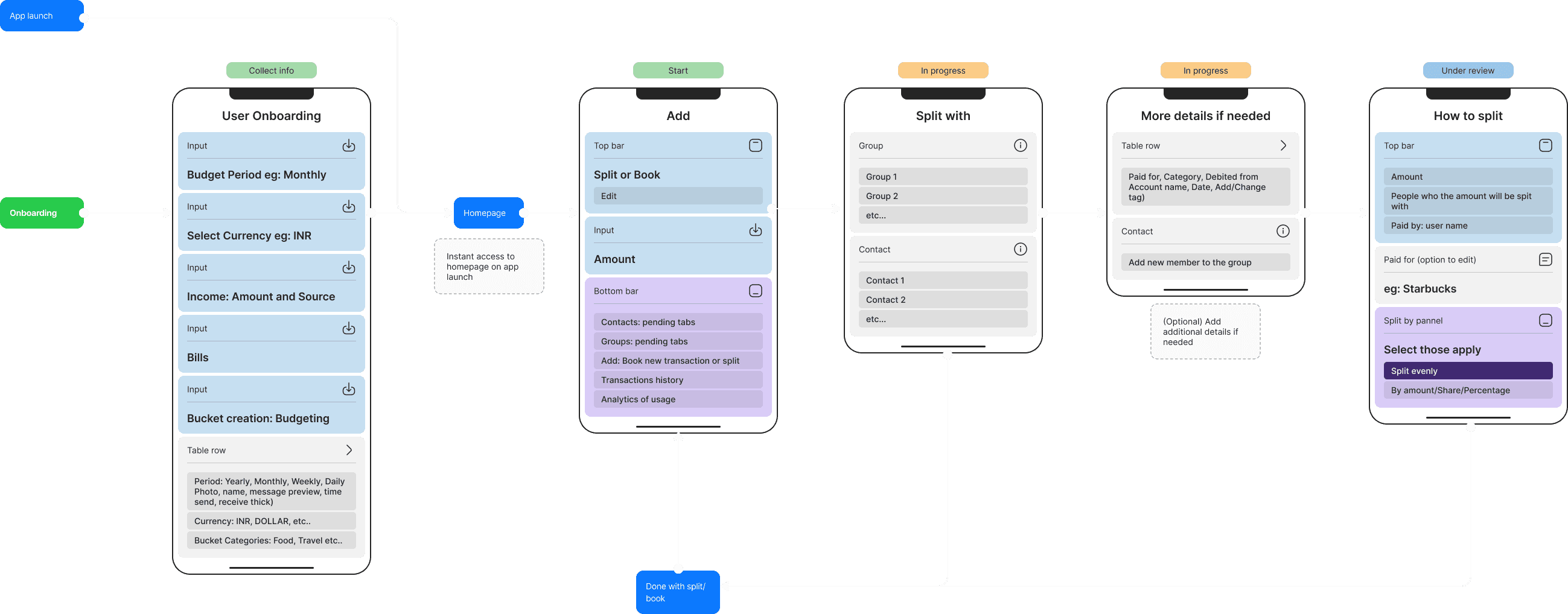
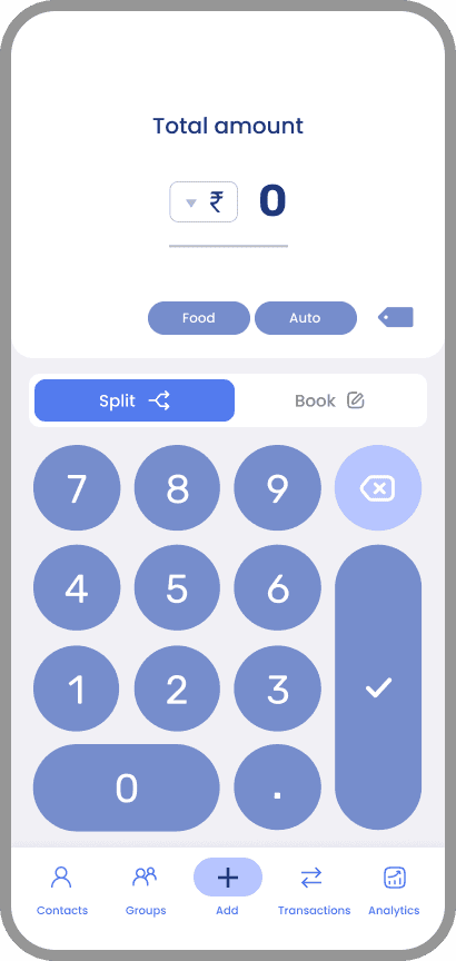
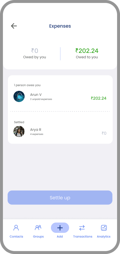
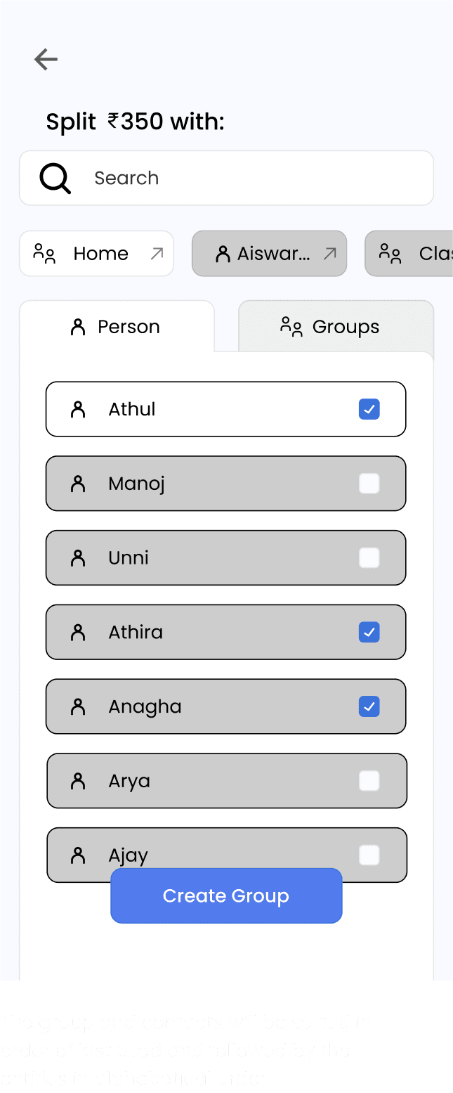
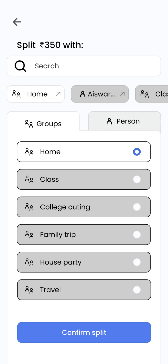
Some of my initial thought processes regarding our research and the goals for our app. The low-fidelity designs gave us the first glimpse of how our app could work with all the critical functionalities implemented. A user-friendly interface designed to simplify expense tracking and bill splitting. Key screens include a dashboard for an overview of shared expenses, an expense entry form for adding and splitting bills, real-time notifications for payment reminders, and personalised financial insights. These frames emphasize simplicity, transparency, and effective financial management.
Based on user research, we learned that personalizing the app in both dark and light modes was important to our users. So, we created high-fidelity designs for both modes. We started with the light mode designs and then carefully converted them to dark mode, ensuring that the user experience remained consistent and visually appealing in either setting. This approach not only caters to user preferences but also enhances accessibility, making our app versatile and user-friendly regardless of lighting conditions.
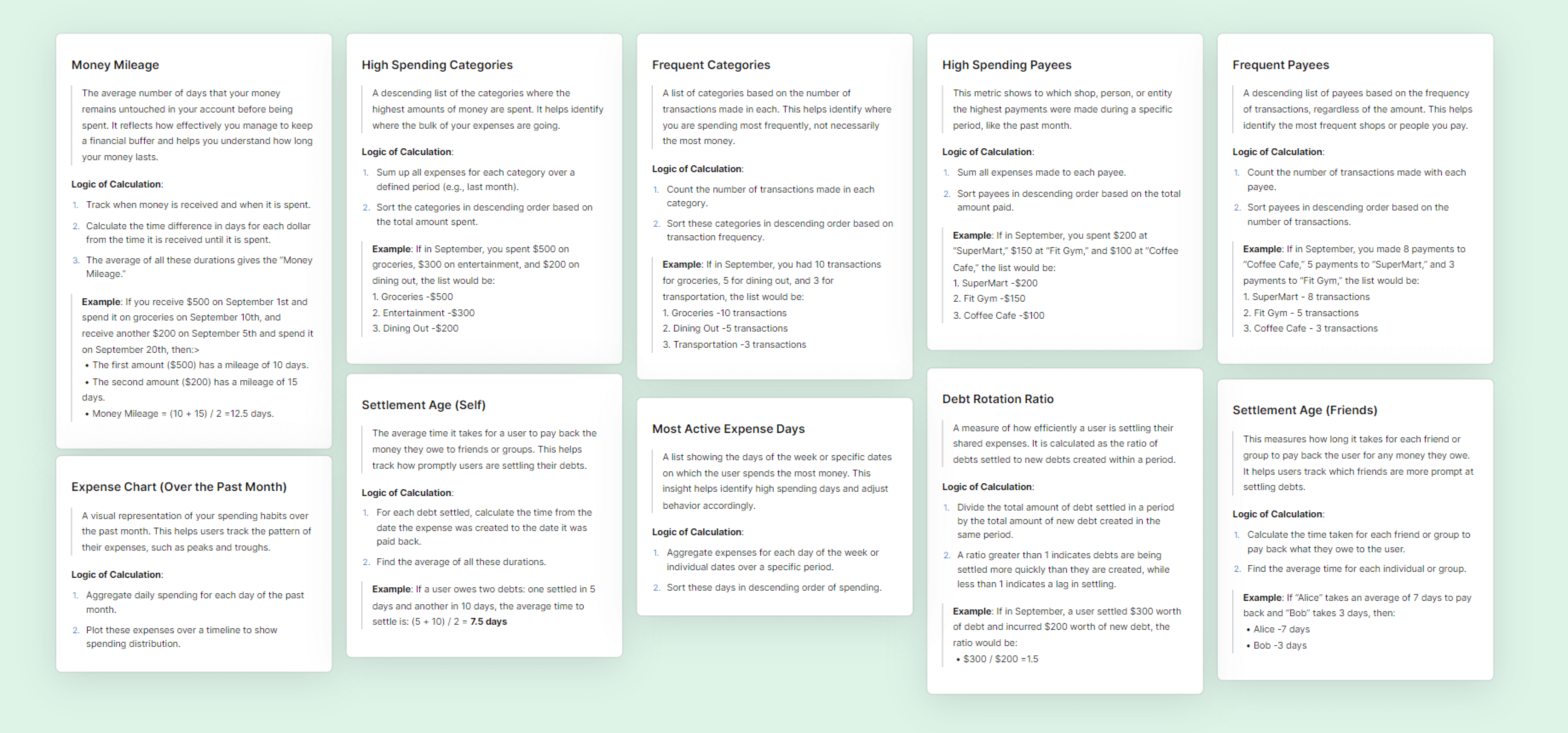
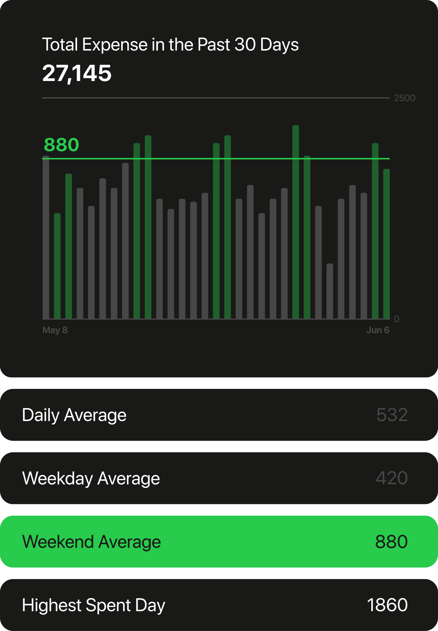
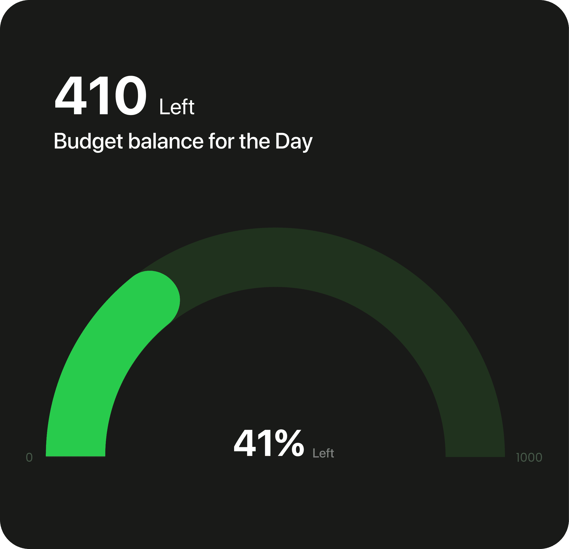
Analytics screens are key to the app’s success, so we had to design them carefully. We held multiple discussions to focus on the important insights about user behavior and our product goals. We've narrowed it down to a few key graphs, and we're still working on some of them.
The app's navigation is designed for simplicity and efficiency. Users can quickly launch the app, input the amount and a note for reference, and then move on. If they want to add more details later, they have that flexibility. The additional tabs in the navigation bar offer extra features that enhance how users manage and view their budget.
All the charts were created according to the Swift UI guidelines set by Apple WWDC22, the guideline of Apple Car play was also studied as the apple Car play dashboard is dynamic and can be personalized from one auto brand to another.
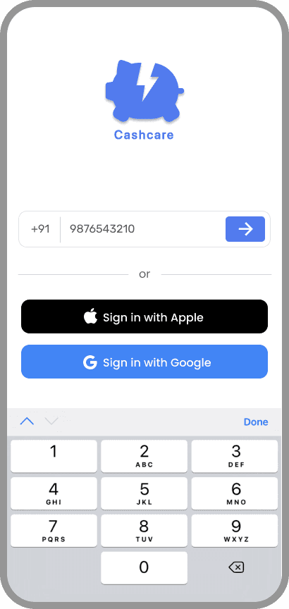
Based on our extensive research, we decided to use variants of blue for both dark and light modes, selecting #0F88F2 as the primary color. This hue isn't just aesthetically pleasing and strategically reinforces our app's values of trustworthiness, professionalism, and user comfort. It’s a color that will resonate well with our audience, elevate the overall user experience, and more:
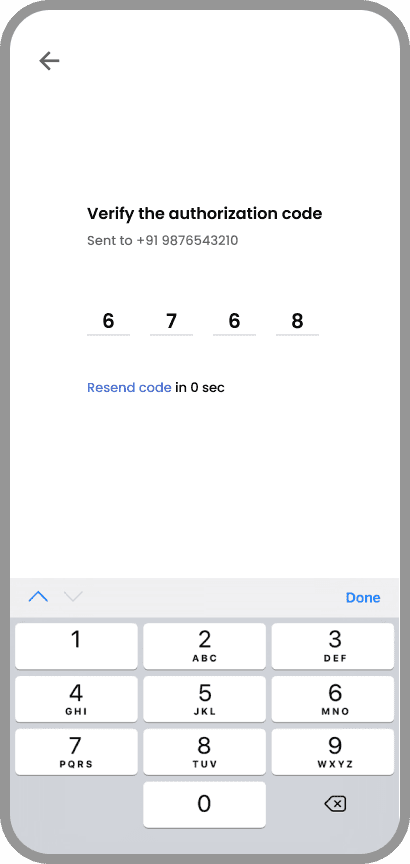
I chose San Francisco Pro as the font for our app because of its sleek, modern look and excellent readability. It ensures that all the text is clear and professional, which is vital for a budget management app where precision matters.
For the icons, I mainly opted for line icons. They give the app a clean and minimalist aesthetic, making it easy on the eyes and simple to navigate. However, in places where grabbing the user's attention was crucial, I used filled icons. These act as visual anchors, guiding users to key features or important information without overwhelming them.
In essence, the combination of San Francisco Pro and a mix of line and filled icons strikes the right balance between elegance and functionality, ensuring a seamless and user-friendly experience.
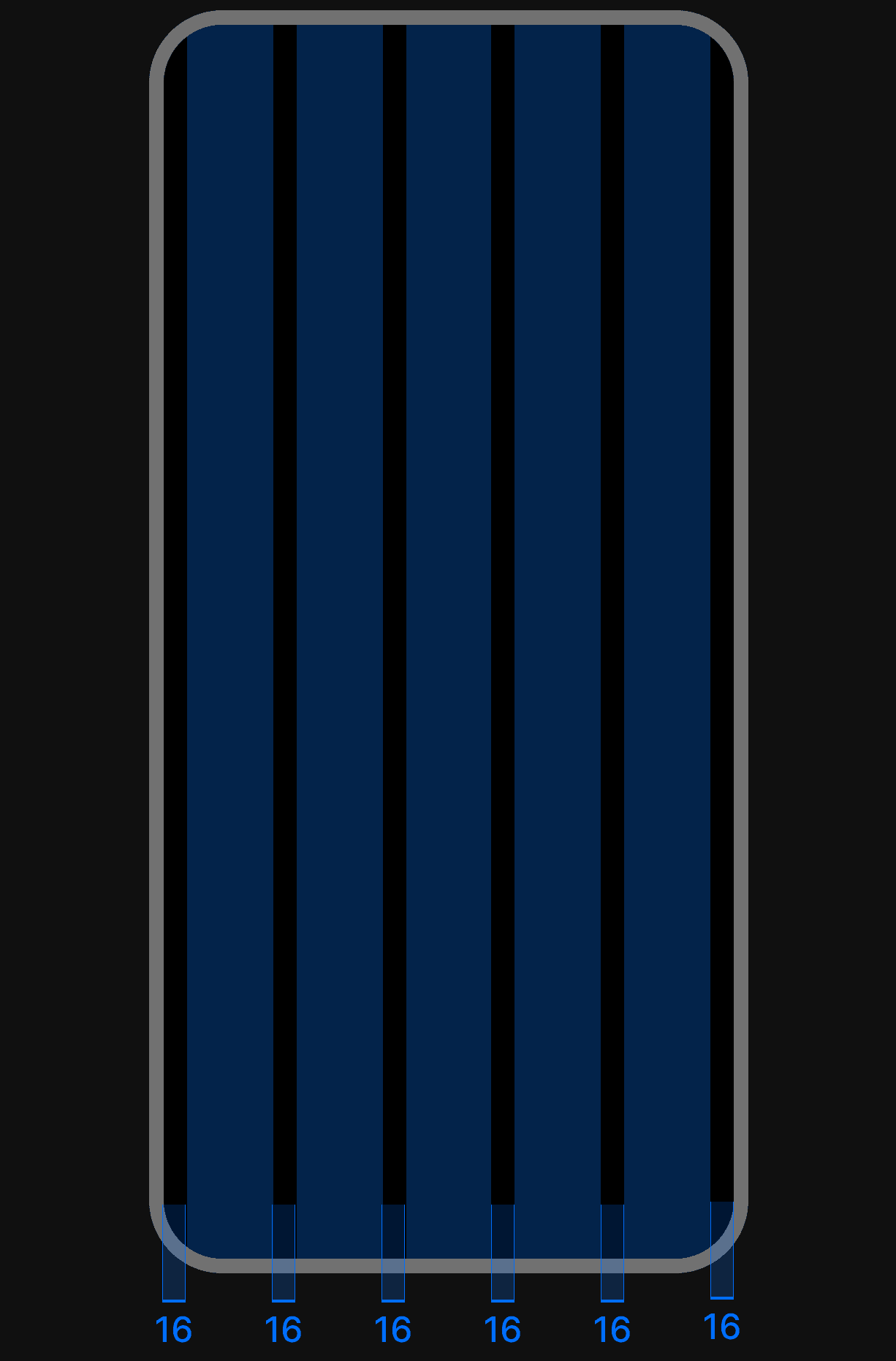
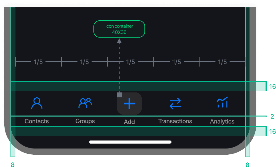
We decided to go with a 5-column layout for our iOS app, with 16px margins and gutters, aligning with Apple's design guidelines. This layout is not only visually appealing but also functional. The navigation bar has 5 icons, fitting perfectly with the 5 columns, providing a balanced and intuitive user experience.
Using the 16px margins and gutters ensures our app feels clean and organised, making it easy for users to navigate and manage their finances. The 5-column layout also scales well across different screen sizes, maintaining consistency and clarity.
In short, this grid system enhances the app’s visual hierarchy, optimizing both functionality and user comfort. It’s all about making the best use of space while keeping the design elegant and user-friendly.


FINAL DESIGNS
Iconography and Typography
FINAL DESIGNS
Grid system


FINAL DESIGNS
Design System
To create a cohesive and user-friendly design system. It’s all about making the best use of space, maintaining visual hierarchy, and ensuring a consistent and engaging user experience. Here, the grid layout, typography, iconography, and primary color choice—come together to create a cohesive and user-friendly design system.
FINAL DESIGNS
UI for Launch
During research, we found that a key point of the user's need was personalization, in dark mode and light mode variations for the app. So we decided to do the light mode and dark mode variations in parallel. and below you can see the updated screens in dark mode.
IDEATION
High-Fidelity
To provide some background on our vision, we believe that stores are evolving into social clubs. Through our app Visavis, we aim to facilitate a future where brands can accomplish several key objectives. These include acquiring new customers, fostering engagement through real-life events and experiences, incentivizing valuable actions with points, conducting surveys and polls, and cultivating genuine relationships within their store communities.
The product development is still in progress, and the launch is set for May 2025. Any updates and insights gained post-launch will be updated here.
REFLECTIONS